
Subtotal $0.00 Subtotal: $0.00

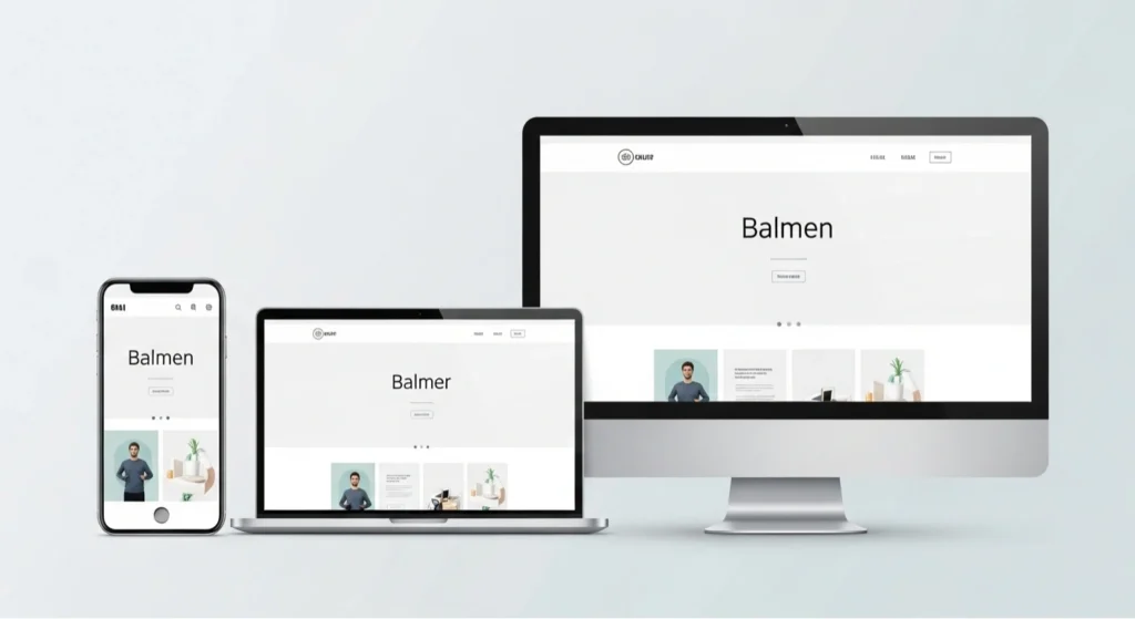
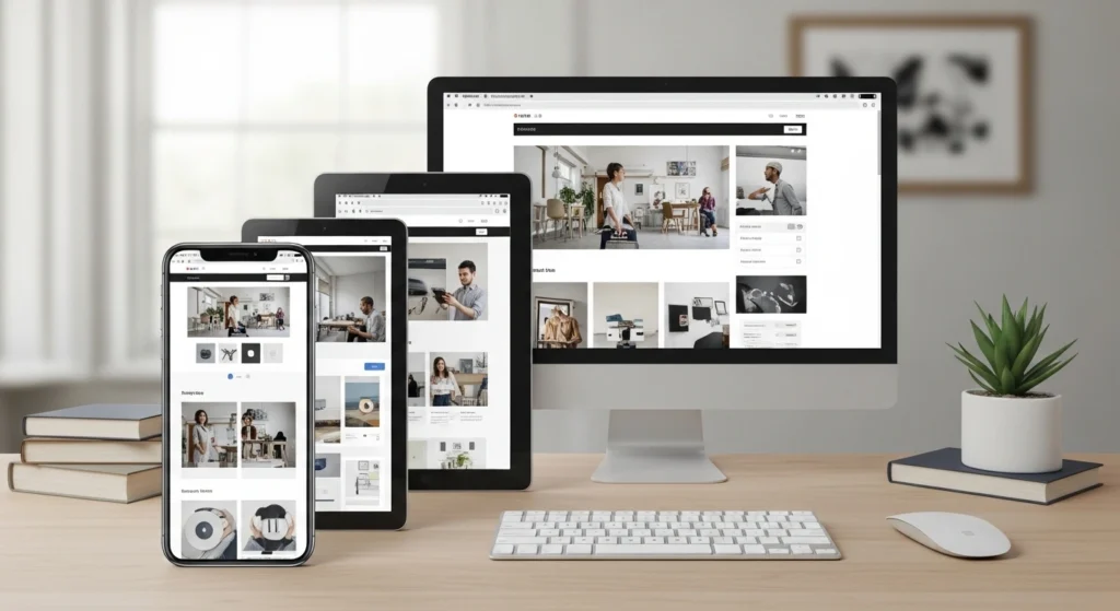
You use your website across many devices every day. From mobile phones to large desktop monitors, your audience sees your web pages on screens with different screen sizes and resolutions. A website that stays usable and readable across all of those screens matters now more than ever.
Responsive web design is the approach that makes your site change its layout and presentation to match the user’s device. This means the structure of your responsive homepage design, or any other page, shifts so that content looks right whether someone browses on a phone or a desktop. The rise in mobile and tablet browsing means a majority of site visits now come from devices other than desktops. If your design doesn’t adjust, readers must pinch, zoom, or scroll sideways just to read your content.
This guide walks you through what responsive web page design is, the core principles behind it, steps you can follow to implement it, and best practices that will keep your site up-to-date in 2026.
What Is Responsive Web Design?
Responsive web design means building a website so it changes its layout, images, and typography to match the screen width of the device viewing it. The design structure responds to the viewport size and presents content that is readable, navigable, and clear without forcing users to change their device orientation or zoom manually.
A mobile-responsive website design ensures your content fits smaller screens as cleanly as it does on large desktop displays. These changes happen with CSS rules that adapt the structure based on screen sizes. Designers no longer need separate versions for mobile, tablet, and desktop. Instead, one site reflows content using the same code, which keeps maintenance simpler and improves user satisfaction.
Responsive design is essential both for user experience and for your site’s visibility in search engines. Google and other major search platforms use mobile-first indexing, so a site that isn’t mobile-friendly may struggle to rank well. Responsive design ensures Google reads the same content across devices, which is better for SEO and consistent ranking.
Key Principles of Responsive Web Design
Responsive websites rely on clear principles that guide how content and layout adjust to different screens.
Fluid Grids and Flexible Layouts
A fluid grid lets layout elements, such as columns and containers, use relative units, such as percentages, instead of fixed pixels. This keeps page elements linked to the screen width rather than a fixed value. When the screen gets wider or narrower, your layout resizes proportionally without breaking.
Modern CSS tools like Flexbox and CSS Grid let you structure layouts in flexible ways. These systems distribute space intelligently between elements and let your layout respond to device width without extra code. Using relative units such as %, em, or rem makes your layout fluid and easier to manage across devices.
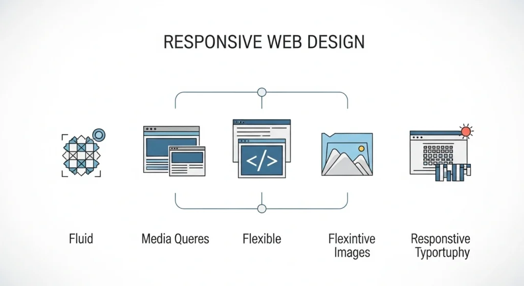
Media Queries
CSS media queries are rules that let your site apply different styles based on device features such as screen width. You define breakpoints, which are specific width thresholds that trigger a layout change. For example, you can say:
- If the screen width is under 320px, stack elements in one column.
- If screen width is 768px or wider, use a two-column layout.
- If the screen width is 1024px or wider, allow three columns.
Media queries look like this in CSS:
@media (max-width: 768px) {
.container {
flex-direction: column;
}
}
This snippet tells the layout to switch direction when the viewport is narrower than 768 pixels.
Flexible Images & Media
Your images must fit their containers without forcing the user to scroll sideways. This requires responsive techniques such as:
- Setting image rules like max-width: 100% so images shrink with their container.
- Using the srcset and sizes attributes to serve different image files based on screen width.
- Applying CSS rules that prevent overflow from breaking out of fluid grids.
These techniques let your images scale cleanly on mobile devices and large desktop screens, keeping them crisp and clear without distortion.
Responsive Typography
Text must remain readable regardless of screen size. Use relative units such as em or rem for font size so text scales with the viewport or user settings. This ensures content stays legible whether someone views your site on a large desktop or tiny phone screen.
Designers must balance text size with line length and spacing so users aren’t forced to zoom just to read a paragraph.
Best Practices
Responsive design isn’t just about fluid grids and media queries. You must make decisions that respect usability across devices. Some best practices worth following include:
Mobile-First Mindset
You start with the layout for the smallest screens and build up for tablets and desktops. This approach forces you to focus on essential content and functionality first. That keeps your design lean and ensures your critical content appears clearly on phones before adding layout changes for larger screens.
Navigation That Works Everywhere
Navigation needs to adjust when a screen shrinks. On desktops, you may show a wide menu, but on screens like mobile phones, you use a hamburger menu ora collapsible list that users can tap. Keep menus clear, easy to use, and large enough so taps register without error.
Make Touch Targets Comfortable
Buttons and links need space. On mobile phones, users tap with fingers, so you must size interactive elements so taps hit reliably. Small targets create frustration and lead to higher abandonment.
Maintain White Space and Readability
White space lets your content breathe. Crowded text or buttons jammed too close together reduce clarity. Use spacing to separate content blocks, focus attention, and make reading easier on any device.
Test Across Devices
You need to test your design on real devices and simulators like BrowserStack or built-in browser testing tools. This makes sure your layout behaves correctly on different mobile devices, tablets, and desktops. Regular testing helps catch issues such as layout shift or broken elements before your audience sees them.
How to Implement (Step by Step)
Executing a responsive design means applying principles in a logical workflow. Here is a clear path you can follow:
Add the Viewport Meta Tag
First, add this line to your HTML’s <head> section:
<meta name=”viewport” content=”width=device-width, initial-scale=1″>
This tells browsers to render the page width at the actual device width, so your CSS rules take immediate effect. Without it, your layout may stay fixed to a desktop width even on mobile screens.
Set Base Font and Layout Using Relative Units
Use relative units like em, rem, and % instead of pixels. This makes text and layout elements scale naturally with screen size.
Define Breakpoints
Decide where your layout needs to be adjusted. Common breakpoints include widths like:
- 320px or below (small phones)
- 768px (tablets)
- 1024px and higher (desktops)
At each breakpoint, apply CSS rules that refine your layout and typography.
@media (min-width: 768px) {
.grid {
display: flex;
}
}
This CSS snippet could tell your layout to use a flexible row arrangement once the screen is wide enough.
Create Fluid Grids Using CSS Grid or Flexbox
Leverage modern CSS layout tools:
- Flexbox helps distribute space within a container and align items.
- CSS Grid lets you define two-dimensional layouts where elements can reposition based on available space.
These systems let your content flow without rigid boundaries.
Optimize Images and Media
Add responsive rules for images, using max-width: 100%, height: auto, and tools such as srcset to deliver the right media size for the device requesting it.
Test and Debug
Check your pages on multiple devices or with browser tools that simulate screen sizes. Fix issues like overlapping elements or text that breaks lines poorly.
SEO and Performance Benefits
Responsive design does more than make your content look nice. It matters for how your site ranks and performs.
Search Engine Rankings
Search engines prefer mobile-friendly sites because they serve content consistently across UI variants. A single set of content and one URL structure means your pages are easier for crawlers to index and index accurately.
User Engagement
Visitors who see your site work seamlessly on their device stay longer and interact more. That lowers bounce rates and encourages readers to browse deeper. When users find content clear and easy to navigate, they are more likely to act — whether that’s reading another page or contacting you.
Conversion Potential
If your layout works well on phones, more visitors complete actions such as signing up or buying a product. Removing friction increases trust in your brand and makes your site feel reliable.
Performance Metrics
Responsive sites often tie closely to Core Web Vitals, like Largest Contentful Paint and Cumulative Layout Shift. A clean, fluid layout that loads efficiently on all devices supports faster page display, smoother visuals, and better interaction counts, which positively impact user satisfaction and SEO.
Also Read About Law Firm Website Design Tips and Best Practices
Common Mistakes to Avoid
Don’t let simple errors undo your efforts. Here are design mistakes that often arise:
Hiding Too Much Content on Mobile
Removing essential content from mobile versions just because of space limitations can leave users confused or missing key information. Always prioritize clarity and usefulness.
Using Fixed Widths
Fixed widths tied to pixels break when the device width changes. That creates horizontal scroll or cramped layouts on smaller screens. Always use relative units, so elements respond to screen width.
Slow Loading Images
Large image files hurt performance, especially on mobile devices with limited bandwidth. Always use responsive image techniques and compress files to suit each device.
Conclusion
Responsive website design means building your site so every user gets a smooth, readable, and functional layout, no matter the device they open it on. It’s essential for modern web presence because users expect clear content, whether they browse on mobile phones, tablets, or desktops.
You can’t skip fluid grids, media queries, flexible images, or responsive typography if you want site visitors to stay and interact. A good responsive design helps your site show up in search engine results, keeps people engaged, and supports conversions across screen sizes.
Keep testing your site with real devices and simulators, and refine breakpoints and layouts based on real behavior. Take time to implement responsive principles consistently. Your audience will respond with longer visits, more interaction, and greater trust in your content.
