



Get Professional Mobile Website Design Built for Every Device

Your website needs to work properly on smartphones, tablets, laptops, and desktops. Our mobile website design company create your website responsive, fast, user-friendly that support your business goals and give visitors a clear path to contact, purchase, or take action.

PROFESSIONAL MOBILE-FIRST PLATFORM

Why Mobile Website Design Matters for Your Business

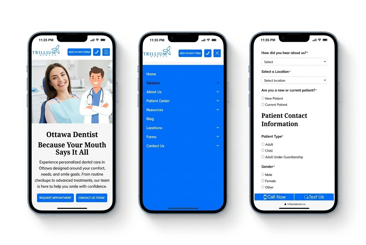
A large share of website visitors use mobile devices. Your website must provide clear navigation, readable content, touch-friendly controls, and fast page loads across different screen sizes. Our mobile website development focuses on:
Trillium Dental mobile website design
TRANSPARENT PROJECT PLANS

Choose the Right Mobile Website Design Package

Starter Plan

For small businesses that need a professional mobile-friendly website.
CAD 499 /Month
  • Responsive website design
  • Mobile-first layout
  • Core Web Vitals compliant
  • Monthly content updates
  • Mobile navigation
  • Contact form
  • Basic SEO setup

Professional Plan

For businesses that need a custom mobile website with more features.
CAD 799 /Month
  • Custom responsive design
  • Mobile UX structure
  • Speed optimization
  • Lead forms
  • SEO setup
  • Touch-optimized navigation
  • 3 rounds of revisions

Premium Plan

For complex websites, eCommerce stores, and custom business requirements.
CAD 1099 /Month
  • Mobile UX audit included
  • Responsive rebuild/retrofit
  • eCommerce features
  • Third-party integrations
  • Technical SEO
  • Core Web Vitals optimization
  • URL structure preserved
  • 3 rounds of revisions
Our Portfolio

Check Out Our Recent Work

WHAT WE OFFER

Comprehensive Mobile Website Development Services

We create mobile-first websites that work across smartphones, tablets, laptops, and desktops. Our mobile website design service cover responsive design, development, user experience, performance, and mobile SEO.

OUR PROCESS

How Our Mobile Web Design Company Works

Discovery & Strategy

We review your business goals, target audience, website requirements, content, platform, and conversion objectives. This stage defines the project scope, page requirements, technical direction, and mobile design strategy.

—Pngtree—rising arrows_5990754

Design & Development

We design the mobile interface and develop the website around responsive layouts, clear navigation, engaging content, and required functionality. The website works seamlessly across smartphones, tablets, laptops, and desktop screens.

Testing & Optimization

We test layouts, navigation, forms, buttons, content, images, performance, and functionality across relevant screen sizes. We address usability and technical issues before the website launch.

Launch & Support

We prepare your website for launch and provide post-launch support according to your project scope. Your website goes live with the required mobile functionality and support in place.

0 %+

Toronto searches happen on mobile

0 %+

Users leave if site loads > 3s

0 %

Skilled Experts

# 1

Mobile-first indexing by Google

YOUR MOBILE WEBSITE PARTNER

Why Choose Toronto Web Development for Your Mobile Website?

We creates websites that combine responsive design, practical UX, technical development, and search-focused structure. Our approach focuses on the actual requirements of your website rather than a standard template.

WHAT OUR CLIENTS SAY

What Clients Say About Our Mobile Website Design Work

Communication was clear, responsive, and professional throughout the entire website project. The team was cooperative, easy to work with, and helped make the project smooth and efficient.

Steven Buckley

Steven Buckley

Occupational therapist

Everything was completed as requested, with great attention to detail and clear communication throughout the project. I was very happy with the final website and the overall quality of the work.

Walter Miller

Walter Miller

Travel agent

The website has an intuitive user interface that makes navigation simple. The content is well organized, and the overall layout makes it easy for visitors to access the information they need.

James Cordon

James Condron

Crown prosecutor

The team was responsive to our requirements and handled our website requests with care. Their attention to detail and willingness to address our concerns made the development process much easier.

Daniel Burn

Daniel Burns

Surgeon

YOUR QUESTIONS ANSWERED

Frequently Asked Questions About Mobile Website Design

We are a dedicated development team that creates high-quality websites for businesses in Toronto. Our website development services focus on delivering user-friendly solutions that generate real results.

Mobile website design creates websites that work properly on smartphones and tablets as well as larger screens. Responsive layouts, mobile navigation, touch-friendly controls, and readable content form the core of this approach.

A mobile-friendly website makes your pages easier to access on smartphones and tablets. Mobile-first design can support usability, search visibility, lead generation, and eCommerce functions.

Yes. Toronto Web Development provides mobile website design and development services for businesses in Toronto, the GTA, and across Ontario.

The cost typically ranges from $200 to $20,000, depending on your project requirements. Website size, platform, design complexity, features, integrations, and development requirements all affect the final price.

Yes. We can review your current website and redesign its layout, navigation, forms, content structure, and other elements for mobile users.

Yes. Responsive websites adjust their layouts according to the available screen size across smartphones, tablets, laptops, and desktops.

Yes. Mobile website projects can include responsive structures, metadata, technical SEO elements, structured data, and other SEO requirements based on the project scope.

Google recommends an LCP target of 2.5 seconds or less. Actual load speed depends on hosting, code, images, scripts, page content, and other technical factors.

Yes. Mobile eCommerce websites can include responsive product pages, mobile navigation, shopping carts, checkout flows, payment integrations, and customer forms.

Yes. Google uses mobile-first indexing, so Google primarily uses the mobile version of a website for indexing and ranking

Scroll to Top